
Production Diagnostics
Streamlining
Operational improvements
Continuous maintainence
Adoption
Summary
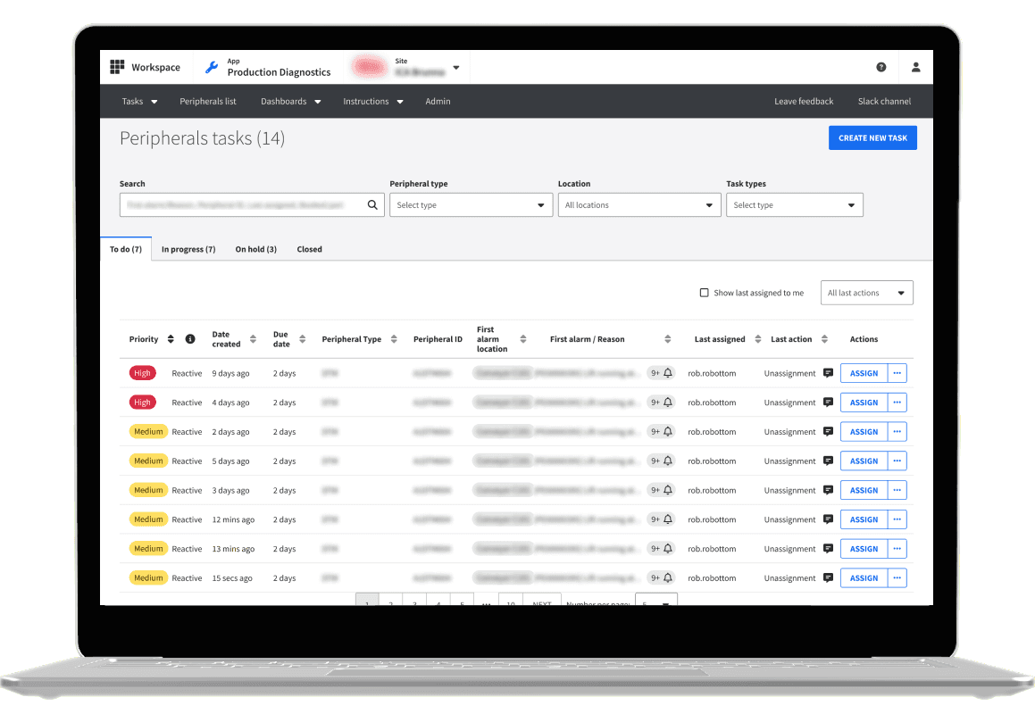
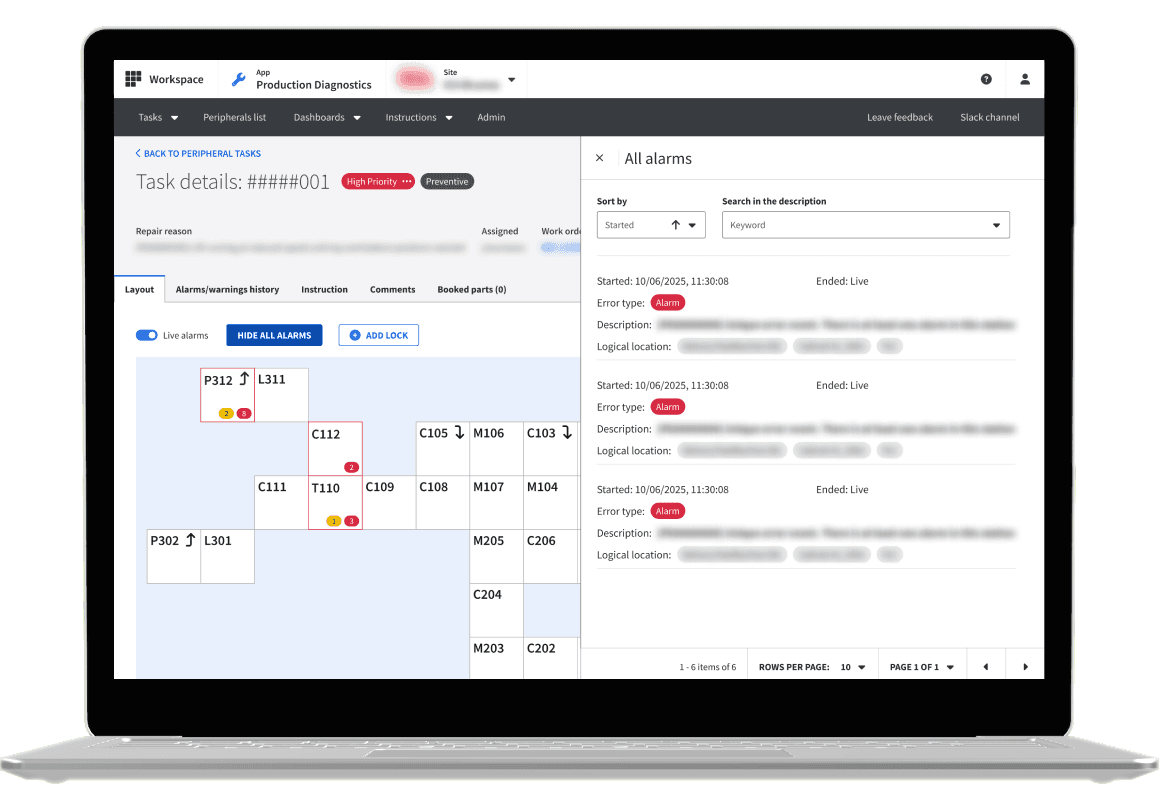
Production Diagnostics is an internal tool used by engineers across Ocado and partner warehouses to manage peripheral and robotic repairs. It centralises repair instructions, tracks fix times, and provides control over key warehouse systems.
Adoption was initially low due to reliance on established third-party tools. My work focused on improving usability and consolidating workflows into a single platform, enabling better data capture and supporting more efficient warehouse maintenance.
My Contributions
• Sole UX practitioner in peripheral portion of PD
• Developed and executed various forms of user research
• Maintained master files with 1:1 likeness to production
• Built trust with stakeholders through communication & documentation
• Released 10+ new features to the platform through tenure
Role
UX Designer, UX Researcher
Platform
Internal tooling | B2B
Team
1 PM | 6 Engineers
Duration
12 Months
The Problem
By the time I joined the team Production Diagnostics was already an established application which had many of the functions of third party applications we used. The primary problem was adoption with the user, which could be narrowed down into two major points.
Trust
Although PD was built with data in mind, it suffered from a lack of accurate data from the user.
Parity
Although most of the basic functions were covered, there were a handfull of actions the user would have to take within other applications. When you're an engineer on the move, this is a really big frustration point.
Approach
Working with Dev and Product
When first joining the team there was a lot of context that I needed to gain in order to work on the product affectively. This meant first of all setting up a sustainable way of working with my PM and other engineers in the team, in action this became:
Daily syncs at the start of each day to discuss recent work and plans for the day ahead, addressing blockers and questions.
Weekly syncs with myself, our PM and Development lead to discuss higher level topics which would influence how a product is built, mostly focusing on technical limitations or upcoming research.
Twice-weekly syncs with myself and the PM to keep each other up to date on recent findings, designs or larger changes to the structure of a feature.
The creation of a slack channel to be used for ad-hoc questions or organisation of meetings to discuss design decisions.
Adding a 'UX' tag to the team Jira so I would be aware of what tickets required attention from a UX perspective
Prioritisation
To manage ongoing improvements, the team introduced a dedicated UX workflow within Jira, allowing design work to be prioritised alongside product and engineering tasks.
Prioritisation was driven primarily by user needs and business impact, focusing on reducing friction in peripheral repair workflows and improving the reliability of operational data. Rather than large feature releases, the work centered on continuous, incremental improvements that made the product easier and more effective to use over time.
Research Cadence
Research was typically conducted on an ad-hoc but continuous basis due to our close access to users within CFCs. This allowed me to regularly speak with our users directly, building strong relationships and gaining immediate insight into day-to-day pain points and workflow frustrations.
Alongside validating proposed changes, research was also used to gather foundational understanding around operational processes and identify opportunities that aligned with wider product strategy. This continuous feedback loop helped ensure improvements were grounded in real user needs rather than assumptions.
Iterative Delivery
Work on Production Diagnostics was delivered iteratively, with most changes being smaller in scope and focused on improving existing workflows. This allowed for quick feedback cycles, continuous refinement, and regular collaboration with both users and teams across the wider PD space, ensuring improvements were impactful while maintaining a consistent design language.
Impact over time
Adoption
FullStory was used to track adoption and user behaviour, helping validate iterative improvements allowing us to track a ~30% increase in PD for peripheral repair adoption across customer fulfilment centres.
Features Shipped
Throughout my time on Production Diagnostics, I delivered around 20 UX-focused tickets, contributing to continuous improvements across workflows, usability, and operational tooling.
Consistency
Working closely with another designer, I helped establish consistency across Production Diagnostics by standardising components and interaction patterns, ensuring behaviours across the platform felt cohesive and predictable for users.
Key Achievements


